Tote Dashboard
A single application that provides visibility into every part of a distribution center

Overview
Shifting gears from e-commerce, this project was my dive into the operations and logistics world. It's all about giving team members visibility to different areas of the distribution center. Packed with loads of data points, this dashboard was built to make daily operations run smoother.
*Note: data points have been altered for privacy purposes.
Role
UX Designer at Omaha Steaks
UI Design, Interaction Design, Field Study
EMPATHIZE
New Processes = New Opportunities
The distribution center recently introduced SureSort, an optimized product sorting and handling machine. It seamlessly added products to 'totes' based on the order. Once the order was fulfilled, it'd go to the packing station to be prepped for shipping. While the implementation of SureSort was successful, there was difficulty troubleshooting the "totes". Thus, the need for a new application came into fruition.
My Goal
From order initiation to meticulous packing and delivery, my goal was not only to understand their processes but also to pinpoint where this application could seamlessly integrate into their daily routine.
Methodology
To truly connect with users, I put on my safety goggles and ear plugs to spend a day at the distribution center. Engaging in candid conversations with team members and supervisors, I delved into the nitty-gritty of their daily operations.
Common Themes
-
Users relied on different Excel spreadsheets at a time to parse and synthesize information.
-
Users wanted visibility in other areas to gauge their workflow.
-
Users wished for real-time updates at a glance as opposed to multiple file downloads a day.
DEFINE
The Problem
Lack of visibility into distribution center progress made it difficult for team members to identify and troubleshoot errors efficiently, leading to extended after-hours work and operational friction.
IDEATE
Stakeholders' Design Proposal
The application was developed in two phases. The stakeholders' suggestion for the first phase included tables with hover states for more in-depth information. It was evident that their use of Excel greatly impacted their ideation.

OUTCOME
What's Happened Since?
Since its release, I strolled through the distribution center once again, eager to observe how they use the application. Team members and supervisors expressed excitement and daily use of the application. This application considers a TV mode which displays throughout the center for active monitoring.
The application shortened what used to be long nights at the distribution center. It also increased efficiency by 30% since members were able to keep track of progress in real time.
Here's What They Had to Say
"This has been so great, being able to look at it and know the progress of the entire complex."
"We use it everyday to help us monitor production."
"It's awesome! If I notice trouble, I can just tap to see more information and understand what's wrong."
Over and Over Again
While mapping out the potential user flow (below), I noticed that each screen repeated the same or very similar information. At this stage, the concept felt like a loop.
Vocab Breakdown
-
Tote – A box holding products for a single shipment
-
1A (and similar) – A machine with multiple totes positioned on either side also known as a Pod
-
Ship mode – The shipping hub for trucks
-
Status – A code describing the current state of a given tote


Problem Framing
How might we ________ __________?
[verb]
[issue]
To reframe the problem, we asked HMW:
-
understand what information is critical for which team members?
-
allow users to access granular data without cluttering the UI?
-
indicate when a data point is alarming?
First Iteration
After the user flows, the first iteration was born! It included an overview screen and navigational tabs to dig deeper.
What Changed?
Upon discussion among the UX team and internal stakeholders, the information was extremely repetitive. The interface was messy and data points were the same, but placed in different spots. Why repeat information?

Overview (Default Display)
-
Acted as a dashboard for high-level information.
-
Showcases the relationship between the Pods and Statuses upfront.
-
'Ship Modes' section to highlight the completed totes.
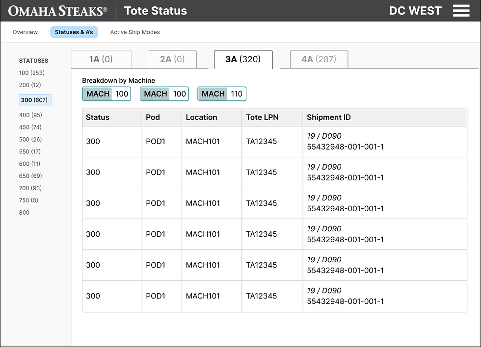
Statuses & Pods
-
Allowed user to exclusively see and sort information via Pod and Status.
-
Provided the most granular detail of a given tote.
Why It Missed the Mark
More questions arose such as:
-
Where did the tab navigation via Pod come from (when switching from the Overview screen)?
-
What are the statuses? What if there were none?
-
Why were there so many number indicators? What did they mean?

Active Ship Modes
-
Organized information based on the shipping hub which it would be sent
-
It would only show ship modes needed for the day.
Why It Missed the Mark
-
It was a carbon copy of information from other screens.
-
Number indicator was slightly clearer, but was it necessary?
-
How is this screen relevant to the rest of the information?

All Totes
-
Instead of having screens separated by specific categories/options, the design pivoted to be akin to a results page.
-
This approach generated results based on the user’s chosen filter and sort options, making it flexible and adaptable for any type of team member.
-
Consolidated the Statuses & Pods AND the Active Ship Modes screen into an encompassing "All Totes" section
IMPLEMENT
Ta da!
The final product included a greatly simplified the overview screen and filter-able entries. Overall, the application conveys the information stakeholders deemed necessary to make informed decisions around the warehouse.


